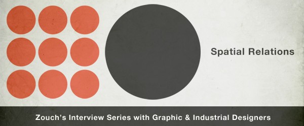
Spatial Relations #5 – An Interview with Thomas Quinn
Interviews, Spatial RelationsThomas Quinn is a recovering “fine artist” who puts typefaces at the center of his work. He reads the tension between technological possibility and hand-crafted designs as an on-going historical epic, suggests “flat design” is little more than a naked emperor, and refers to Helvetica as “training wheels for graphic designers.”
1) What made you want to become a graphic or industrial designer?
I actually really wanted to be a fine artist my whole life up until college. Whenever I went on portfolio reviews I was always told that I should consider graphic design, which I always took as kind of an insult because I thought my big strengths were drawing and painting, and that graphic design meant ignoring those abilities in favor of working solely on a computer. When I got to art college, it became clear that a lot of people can draw really well, but the real asset any artist/designer has is vision, and having a sense for composing a page. I look back on my old work from high school and laugh at my resistance, and see exactly what those portfolio reviewers saw, that I was basically doing graphic design with pencils and paint.
2) Who are your influences?
Stefan Sagmeister is a big one. I’ve always loved how conceptual and original his work is, yet it still always looks amazing. And like everyone that dabbles in hand-lettering: Jessica Hische. Chris Ware was also a big influence in getting me to look closer at typography as something that can be drawn. His work really helped me see that my drawing abilities didn’t have to be wasted if I decided to become a graphic designer.
3) What design movement(s) do you most identify with?
The Blue Note jazz record covers from the 60s are always something I’ve loved. Seeing those record covers in high school was probably the first time I really took notice of graphic design. The little twists they put on relatively simple compositions, always with a black and white photo, a single color and some sort of interesting framing is something I think I still borrow from in my work, whether I’m really realizing it or not.
4) How would you describe your “process”?
My process always begins with typography. For almost every project I pick out the typefaces I think I’d like to use, get the basics of the type set, then build the design around that. Typography contributes so much to the look and feel of any design that I find it hard to incorporate it late in the process.
5) What work(s) or project(s) do you consider your masterpiece(s)?
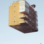
I feel a little uncomfortable calling anything I’ve done a “masterpiece,” but a couple of my favorite projects I’ve done are the poster I did as a take away for an 826CHI fundraising event, my first anamorphic type installation, and my latest typeface Volterra but probably just because it took so much work.
6) What are you working on right now?
I’m working on another book cover for 826CHI, a website redesign for Girl & The Goat (a restaurant here in Chicago), and a furniture catalog for Holly Hunt.
7) What’s your next project?
Finishing up the italic version of a typeface I released a couple years ago, Volterra. Designing a typeface that you intend to sell is such a slow and grueling process, and it goes even slower when you are just messing around with it on nights and weekends, but I’m hoping to dedicate some more time to finishing it very soon.
8) How would you describe or categorize contemporary design?
I think right now there is an interesting split in that there are a lot of designers doing a lot of interesting things with new technology—like dynamic logos that change every time they are used—but there are also a lot of designers going the opposite direction, hand drawing entire layouts inspired by type from over 100 years ago. I think that kind of split is nothing new, I just think that there are certain points in history when technology plays a bigger role because of where technology is at that time, and I think we’re currently right in the middle of one of those points in time.
9) What design movement(s) or designers do you dislike?
Right now I’m getting pretty tired of everyone jumping on the flat design bandwagon. When done well, or in an appropriate setting (iOS7 is just starting to really hit it’s stride with it), it is really great and effective, but when I go on dribbble.com and see nothing but basic flat icons/illustrations, it gets old pretty quickly. Aside from that, I really dislike the seemingly never-ending Helvetica revival. Helvetica is a great typeface, which is why people have been using it constantly for over 50 years, but the legions of young designers setting some clever little phrase in Helvetica and putting it on a t-shirt is well beyond played out. It’s starting to feel like training wheels for graphic designers.
10) What characterizes your work or style?
I think my work always tends to be very clean looking and focused on typography, but aside from that I try to branch out and do things that don’t necessarily look like all of my other work. That isn’t always easy because I think most designers still find themselves inching back toward their default style even when they make an effort to do something different.
11) What is the most beautiful man-made thing you’ve ever seen?
I remember going to a Chuck Close exhibit in the late 90s that had all of his famous huge photorealistic paintings along with his first few abstracted photorealistic paintings and just having my mind blown. To name a single thing: there is the one particular self-portrait he did in 1997 that is split into diagonal squares which makes it look as if you are looking through a wall of glass blocks. It’s just amazing to look at.
12) What’s the most exciting thing about your profession?
The thing that excites me that most is that it has a lot of overlap with other areas. On any given day I could be drawing a little portrait to be used in a design, or I could be editing a video for a website project, or I could be helping art direct a photoshoot.
13) Which designer(s) should we keep an eye on?
Bud Rodecker at 3st here in Chicago. He’s going to be running things one day. Jackson Cavanaugh (Okay Type), one of the best young type designers in the country. Wyeth Hansen and Ryan Dunn at Labour in NY.
14) Who would be on your “fantasy design team”?
Paul Rand for logo design, Tobias Frere-Jones to design a custom typeface, Marian Bantjes to do some sort of typographic composition, and Rick Valicenti to glue it all together.
 Thomas Quinn is a Graphic Designer living in Chicago, Illinois. He graduated from the Rhode Island School of Design in 2003, then returned to Chicago and worked a number of design jobs before opening his own studio, Blank Is The New Black, in 2011. He also teaches typography at the Chicago Portfolio School. Outside of the traditional boundaries of his standard 9 to 5 client work, he has designed a number of typefaces, created and kickstarted an illustrated calendar, dabbles in painting from time to time, and is “internet famous” for his anamorphic typography installations.
Thomas has a daughter named Zoey and a dog named Rambo. He is an avid Chicago Blackhawks fan. He won the Physical Education departmental award in high school for excellence in gym class. He has a personal goal of eating at a McDonald’s on every continent (aside from Antarctica), and is 5/6 of the way there.