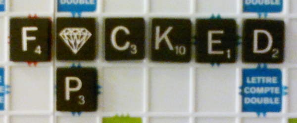
Conjoint Words in the Age of Pixels
Culture, Digitalart above by Emmanuel Laflamme
CoverCake.
BlackBerry.
TweetDeck.
HootSuite.
MySpace.
GrubHub.
Were Rip van Winkle to rouse from his sleep on today’s date, and encounter the above words, he may well take them to be the names of a brand of a lidded confection, a dark hued fruit, a hard toffee, a shrill whistle, a modish pub, a funky greasy spoon.
In truth, they are business concerns, alike in more ways than one, at least, on the surface. All of them are tech startups, which matured, came of age, or were founded in the first decade of the 2000s.
Linger on them mildly longer than is usual, and one would notice that their nomenclature is structurally similar as well.
Each of the above company names is forged by conjoining a pair of two independent nouns, not separated by a glyph. The only concession being that the better (or worse) half is indicated by writing its initial alphabet in capital letter.
Anyone familiar with the micro-blogging site Twitter will know of a more intense version of that.
Ah, hashtags.
A hashtag is a word, or a string of them, preceded by the pound sign that serves as a prelude to the idea contained in a tweet. Its purported function is to signify content, sort it, and organize it.
But, do they really do that?
Lexical tassels that they are, some somnolent from a vowel outage; some panicky from a consonants diarrhea; some burdened with the wrong permutation of the uppercase and lowercase; they create a not too pleasant impression of an iguana with its tail callously chopped off. Crooked, dwarfish, truncated, cluttered, cacophonous, disarrayed, are some adjectives that blur the mind when I see them.
If, for argument’s sake, we throw clarity out the airplane window, there is the other, more important issue to consider—the cognitive challenge that they pose. Deciphering them is, sometimes, no easier than trying to solve an intractable puzzle.
If one were to look at the morphology of our social media writing system, we may see, in it, a faint return to the classical written communication conventions.
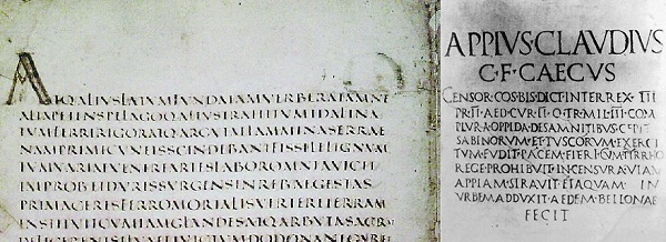
Sometime around 200 A.D., the interpunct, a small centered dot used for inter-word separation in ancient Latin script, faded out of practice. The “scriptio continua” replaced that style, wherein all words ran together as one, without a break, without a space demarcating the boundaries of each.
Skimming such continual script was not merely difficult on the eye, but was also a drag on the brain. Nicholas Carr writes in his acclaimed book, “The Shallows” that it imposed an
“extra cognitive burden” on the reader. And the entire cortex of the ancients’ brains, the forward areas associated with problem-solving and decision making, would have been buzzing with neural activity.
By the 13th century—mercifully—that format became largely obsolete—maybe only to resurface in the age of pixels?











[…] ZOUCH, February 6, 2012. […]